
As I told you in my previous post, I have now finished writing my Jane Austen Devotional. (Learn more about it here and here) Yay! So while it goes through editing, it’s time to start thinking about the cover design.
I love this part of the process. It’s where my interest in art intersects with my love of books. I feel lucky that I get to have so much input into the design. I work directly with a talented graphic artist, suggesting the concept I have in mind and sometimes even contributing my own artwork. Then it’s back-and-forth until we get it just right.
Since this book will be something completely different from any of my others, it opens the possibility of a very different style of cover as well. I can picture the font and the how the words should be positioned. And I’ve decided I want to use a photograph for the background image this time. But what sort of photograph?

option number one
I want something beautiful and serene.

number two
And it can’t be so dynamic that it completely overwhelms the title.

number three
I can imagine that a floral image could work nicely…
number four
or a sunset…

number five
or a water scene…

number six
or maybe a sunset water scene…

number seven
or a glorious mountain picture…

number eight
or even a snow scene…

number nine
or… or… or…
Uh-oh. I’m in trouble. After considering literally hundreds of possibilities, a clear winner still hasn’t risen head and shoulders above the rest. These are the current leading contenders. (In most cases, only a portion of the picture would be used.) I can imagine each of them gracing the devotional’s cover. But of course, I can choose only ONE.
So which one would YOU choose? Give your imagination free rein. Which picture sets the right tone for a devotional? Which would catch your eye and get you to pick up the book? Is there a winner in this batch, or should I go back to the drawing board? Help me out and tell what you think. If I go with your pick, you can brag to everybody how we both have excellent taste! (Please comment below)
But now suppose as much as you choose; give a loose rein to your fancy, indulge your imagination in every possible flight which the subject will afford, and… you cannot greatly err. (Pride and Prejudice, chapter 60)


My favorite image is number two, but I see your point about it overpowering the title. I vote number three. The U.K. is covered with foxgloves in the summer, very green. I don’t think the flowers in the image are foxgloves, but they have tall purple spires. Many gardens in Jane Austen’s stories.
Yes, I love foxgloves too! I don’t know what these tiny wildflowers are, Carol, but they do reflect the calm beauty of a natural garden, which would be appropriate, I think. Thanks for your input!
How about the church in Chawton? Or a church scene of some kind? I put in “church scene” into Pixabay and found some lovely images. I’ll pop them over to you via e-mail.
That’s a great idea, Susanne. Thanks!
I like this this idea as well. Great idea for devotion.
It is a wonderful sentiment. I agree! Or perhaps a quaint interior photo with a tea setting? Or fireplace with a comfy chair?
I lean toward # 9 …..mostly because ‘his eye is on the sparrow and I know he watches over me’….
I actually use that line in one of the devotional segments, Joan!
Number four for simplicity and just a ‘pop’ of colour or number five because it’s calming.
Thanks, Sue! I appreciate it. 😀
I like 1 2 and 7. I think of nature and greens with Jane austen
“To sit in the shade on a fine day, and look upon verdure, is the most perfect refreshment.”
Well, that really is a challenge. #1. Although flowering trees are one of my favorite things, the flowers are too far away and the whole is too busy. Can’t think of any lettering that could compensate for that.
#2. No. I suppose very dark lettering might compensate, but for a devotional?
#3. This might be my first choice. Because the flowers need to be really looked at to appreciate, and the dense undergrowth seems to reflect a ‘digging deeper and listening to that small inner voice.’ I think very pale pink lettering outlined in gold would look nice.
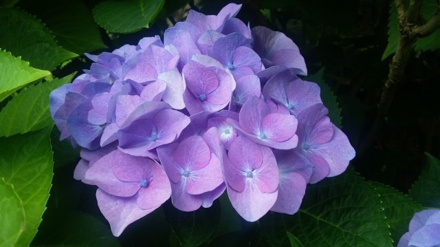
#4. Although the hydrangea in #4 is very large and there is a significant dark space, the color is very restful and calming. It has a balance of dark, medium and light space. The black is not murky, it’s clear. The green and the blue-lavender spaces also have very clear color. It’s a beautiful photo and white, gold, or very pale lavender (outlined) lettering would look beautiful.
#5 and #8 are beautiful with the exception of the very dark spaces.
#6 and #7, I just don’t like. Too dark and murky swampy. Now if a photo of same scene was taken in a sunny daytime, that would be a whole world of difference.
#9. Unless this devotional is all about getting you through the bleak winter then I don’t like it because it looks like the weather is turning bad, and the sun is about to disappear directly, not someplace I want to be out in. Frame it with a window, and a background fireplace and cozy chair reflected in the window. Then, yes!
I know, too much information. This was supposed to actually HELP you with a choice. Has this been harder than actually researching and writing the book?
Haha! No, this is great, Michelle! And such a thorough answer deserves a thorough reply. #1 would require a text box overlay to allow the title and other text to be seen against the busy background. Same for #3. With #2, I would wrap the image around the book, leaving the sky area on the right half to accommodate the title. #4 has two good options – use the dark space for the title, or only using the hydrangea itself, blowing it up to cover the whole book as a background pattern. The others would need to be cropped and/or brightened to work (a graphic designer can do wonders!). I agree that there’s too much darkness (at least the way they’re showing up on my screen), and darkness is not what a devotional should be about!
I like 8 or 5. But a view of Chawton or Steventon church would also be good.
Thanks, Brenda!
5 or 4
Thanks, Lucretia!
I think #5 is very peaceful with its God light shining thru the clouds, however as a previous commenter mentioned, there is an awful lot of dark there. The lake with the lily pads would do nicely as it suggests a quiet serene place, but again the darkness is a downer. The little wildflower scene very pretty, but the flowers seems wrong. BTW, I think the little pink flowers might be Cranesbill (Wild Geranium). The mountain scene beautiful but is perhaps a tad to grand. When I think of a devotional, I think a quiet meditative place. Perhaps an arched walkway leading to a bench in an early morning garden. They are all beautiful, but nothing jumps out at me either. OK, so clearly no help from this quarter, sorry.
Yes, helpful, Barb. With cropping and photoshop magic, we could lighten and brighten. But maybe the reason I’m having trouble deciding is that I haven’t hit on the one that exactly right yet. Thanks for your comments!
One, three or four…..or number 9. They just feel more Jane. If you go mountains or water, it would need to be an obvious connection to her. Just given the gut response with the info at hand. Will obviously need to buy….super excited about it!!!!
Thanks, Linda! Glad to hear you won’t hold my cover decision against me. 😉 The only common theme in the answers (here and on FB) seems to be that there should be, as you say, a connection to JA. And I agree, just not sure how I’m going to do it yet!
I love the snow scene, especially since have been melting where I live and winter is my favorite season!!
Sorry you’re suffering, Diana! Thanks for sharing you opinion, slightly biased though it may be. 😉
#3. It won’t overtake the title, especially if it is slightly muted. It looks like a lovely place for afternoon tea.
That was actually my first pick, Karey. But then, as I kept looking, I kept finding more possibilities to cloud the issue. Thanks for your lovely comment!
Number 5 A sunset speaks to me and make me want to embrace a book.
Good to know. Thanks!
What’s the arc of the story and take it from there
Got it.
Sunset
Thanks, John.
A picture of Derbyshire, or other scenery from English countryside. Perhaps one of the Peaks, an English garden, cliffs of Dover, one of the many Great size Oak trees, a country church set in an English garden.
Good ideas, Tammy. 🙂
I’m going with the beauty and vibrancy of the hydrangea! Gorgeous colour and appealing, it captured my attention immediately, drew me in, and promises beauty in content as well … lovely!
Lovely comments as well! Thanks for sharing your thoughts. 🙂
Number Eight please
Thanks for voting, Kristine!
Pingback: Cover Image Quandary – Part 2 | Shannon Winslow's "Jane Austen Says…"