
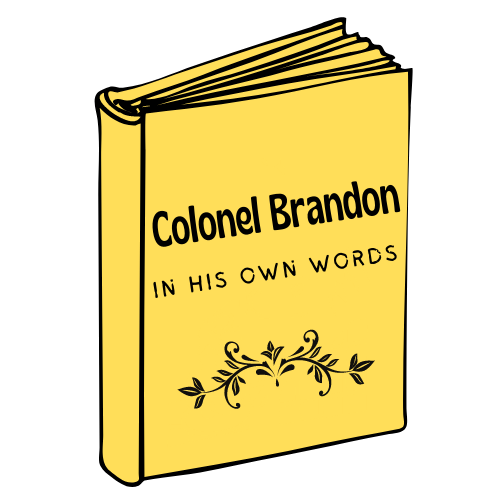
I’m at that awkward, in-between point. Colonel Brandon in His Own Words is basically finished, and it’s out to a few trusted beta readers. Until I have their feedback, I can’t do much more with the manuscript itself. So I’ve been thinking ahead to the cover and even the audiobook.
As many of you know, I have a strong interest in art as well as writing. And so I particularly enjoy the cover design process, which combines the two. I always take a very active role, but I have to leave the technical stuff to my graphic designer. I simply don’t have that kind of expertise.
That’s still true, at least as to the final product. But I did discover a free online design program that has allowed me to play around, indulging my imagination and creating some possible prototypes. It’s pretty addictive, in fact. Once I got started, I was having so much fun I couldn’t stop!
Before I knew it, I had a dozen designs, made, as you will recognize, using images borrowed from the 1995 adaptation of Sense and Sensibility. These are just for inspiration, you understand. I don’t have permission to use the movie stills in the final product.
However an “artist’s rendition” might achieve something with a very similar look and feel (as I did with Fitzwilliam Darcy in His Own Words). So I thought it would be fun to show some to you and take a poll – to see which design you prefer, and if you have any further suggestions! Here are 4 contenders for your consideration.


What do you think? Do you have a favorite? What would you do to improve on it? Which elements do you think are most effective? A new combination to propose? Or is it back to the drawing board?
The Colonel, though disclaiming all pretensions of connoisseurship, warmly admired the screens, as he would have done anything painted by Miss Dashwood… and after they had received gratifying testimony of Lady Middletons’s approbation, Fanny presented them to her mother… “Hum” said Mrs. Ferrars, “very pretty,” without regarding them at all. (Sense and Sensibility, chapter 34)


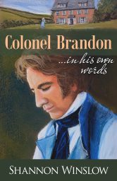


Four, definitely. You are telling us of his thoughts, so here he is by himself, thinking.
Good point, June! Thanks for your comment.
Three. It needs to be clean. The first two are have too much going on. Three is classy and explains the book.
Thanks for dropping by and for your considered opinion, Elizabeth!
THREE! I love that one and I think you should do your own artist interpretation of it. I’m curious to know which is your favourite. I’m not fond of the multi-image depictions. Number three focuses entirely on him and I like that he seems deep in thought.
I’m really torn, Marie. I like things about each one. I don’t think I would attempt #1 – too many faces to paint. And I am favoring the image of Brandon in #3&4. The two image motif (man/house) came from the FD cover, so I kind of like the idea of staying with that concept.
Good point, re: the FD cover. I did love that, and if painted, it will soften the look.
I would scale the cottage down, too, so that it doesn’t compete for attention.
I like number 4 the best with his introspection, the lettering, as well as the banner with the cottage at the top.
Thanks for the specifics! The cottage is really too large, but it was the best I could do with the image I had. So I would scale it down in the artwork, if I go with this design.
Four. Absolutely says we’re in his thoughts. That’s gorgeous.
Thanks, Stephanie!
I like 4 the best, and I feel like it matches the style of Fitzwilliam Darcy’s book the best.
That’s certainly one of the factors I’m taking into account. 🙂
Three. It’s perfect.
Wow! Perfect? That’s great. I guess my job is done. Thanks.
I love that you’re continuing the cover feel from “Fitzwilliam Darcy in His Own Words”, it makes for a cohesive look. With that in mind, I’d pick version 3.
Thanks for casting your vote, Alyssa!
I need to make a correction. Cover 4 is the one I like that would continue the feel of “Fitzwilliam Darcy in His Own Words.”
Apparently, I can’t match titles with the correct picture.
While I like cover 3, the border around the edge reminds me when photographers realized they could add the line border in photos… and then they added it to everything. 😂
Okay, that actually makes more sense.
And yes, adding borders is fun, but not always a good idea! 🙂
I like #4 best, with #3 in second place.
Thanks for your feedback, Robin!
Cant pick between 2&4 love them both
Well, that narrows it down at least. Thanks, Nicole!
Number three hands down, it shows a contemplative Col. Brandon and is perfection in its simplicity. His gaze says it all, he is hansom no doubt but still waters run deep. IMHO
Thanks, Melanie! I appreciate your input. 😀
Three is my favorite…the introspective Colonel Brandon just ‘fits’.
Yes, I see him that way too, Suzanne!
I love #3. It captures his essence so well.
Thanks for your feedback, Katie!
Definitely three — I like the single image; the rest feel too busy, and I really like how thoughtful he looks. I also prefer the subtitle against his dark hair. The only part I don’t like is the yellow lettering for the main title. It’s a bit distracting. Overall, though, this is my fave, with #4 as the runner-up. 😉
I appreciate your comments, Susanne, and will take them into consideration!
I like #3. It is simple but poignant! He is introspective and draws me in.
Good luck with your decision.
Nice to hear from you, Janet. Thanks for your comment.
I like #1 because of the agony written on Colonel Brandon’s face in combination with the HEA on top. It sets of a lot of emotions and I like to be moved.
Best wishes on choosing a cover, it’s not easy to decide.
Thanks for your comments, Elin. They make a lot of sense, but yes, it will be difficult to decide!
My pick is #3. We see the introspective man without any distractions. Although I do love the expression on his face in #1. Remove the picture of the Colonel and Marianne at the top and the picture would be perfect, I think.
Thanks for your feedback, Sonia!
I like #3. Colonel Brandon appears to be reflecting on something important from his life. He has had quite a life and is well-acquainted with grief and disappointment. The photo itself is simplistic and matches the title well
His thoughts lead to his words.
Thanks for your feedback, Marilyn! Yes he is acquainted with grief and disappointment.
I like photo 3
Thanks, Wendy! Your vote has been counted. 🙂