
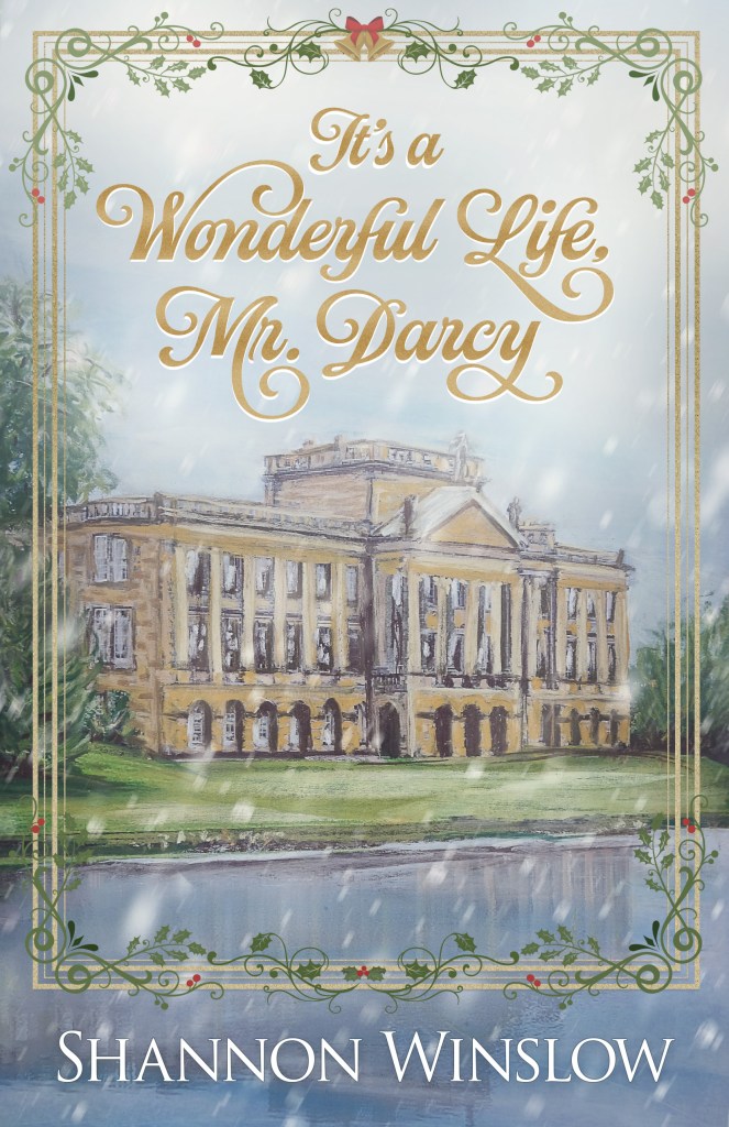
As I mentioned before, I’ve been working on producing a piece of artwork based on Lyme House (Pemberley in the ’95 film adaptation of Pride and Prejudice) to be used for the cover of The Darcys of Pemberley (to be released soon). I did painting (A), a vertical pastel, but then I wasn’t sure I was totally satisfied with it. So I decided to try another. This time I did an acrylic on canvas (B), horizontal so that it can wrap around to form the back cover as well (see Blank Canvas).
  Now I have two completed paintings – two options, two ways to go. Choice is good, right? The problem is that, just as with writing, it’s difficult to be objective about your own work.
“I have no right to give my opinion as to his being agreeable or otherwise. I am not qualified to form one. I have known him too long and too well to be a fair judge. It is impossible for me to be impartial.” (Pride and Prejudice, chapter 16)
Therefore, I’m throwing the question open for fresh opinions. I hear you protesting, like Mr. Wickham above, “I am not qualified.” Well, you may not have the credentials of an art critic, but every one of us has judged a book by its cover. So help me out. Which do you prefer and why? Leave me a comment.
[PS – To see the finished wrap-around cover, click here.]


Initially my vote was for the vertical but I like the idea of a wrap around cover so I changed my vote to the horizontal. Both are great though so you can’t go wrong.
They are both beautiful! For its purpose as a book cover, I think the wrap around is better. The larger sky area is the perfect place for the title, without covering up your artwork, plus the lake forms a slightly askew heart. And I like the splash of pink – it feels happy.
Shannon, I like them both but “B” is my choice its more inviting. “A” has more detail on the building very nice work.
I love love love the first painting, it’s beautiful
Thanks, everybody, for your encouraging comments! I’m not sure we’ve established a solid trend yet, though. So far, it looks like we have a split decision.